Shadow is not a new feature. I remember first using it around 2010 with browser prefix. It's a great feature of CSS that also opens up a lot of possibilities. But if you are like me, working with CSS shadows involves re-learning the syntax almost every other occasion. I forget things. Another problems that I often face with the result is, expectation vs output. For some reason, shadows don't appear exactly how I envisioned it (or is in the design) in the very first try. It often requires adjustment. Maybe it's just me, or maybe it's a common problem.
I decided to learn CSS shadows with a slightly more attention this weekend and this article will be a collection of stuff I picked up during my study.
Remembering the Syntax:
Both box-shadow and text-shadow has almost similar syntax. It usually consists of four numbers and a color. Something like the syntax below:
/**BOX SHADOW**/
box-shadow: <x offset> <y offset> <blur> <spread> <color>;
/*TEXT SHADOW*/
text-shadow: <x offset> <y offset> <blur> <color>;
Now, I remember x-offset and y-offset , but used to forget the order for the next two numbers. which comes first, the blur or the spread. I tried different methods, but all were BS
yes BS , Bad Science, or Blur Spread. however you call it 😇
The shadow color is optional. If you don't specify it, it will inherit from the color property of the element.
The Blur and Spread is optional too. If you don't specify them, the shadow will be as large as the element itself and will have sharp sides (more about them later). One more thing to notice here is: Text shadow does not have spread.
About the blur radius:
The blur radius number confused me a lot. Where would it start. Where would it end. what is the perfect value for my use case. And so on. I read some documentation. Specially the document from MDN helped me a lot. To understand the blur, Let's take a look at the illustration below:
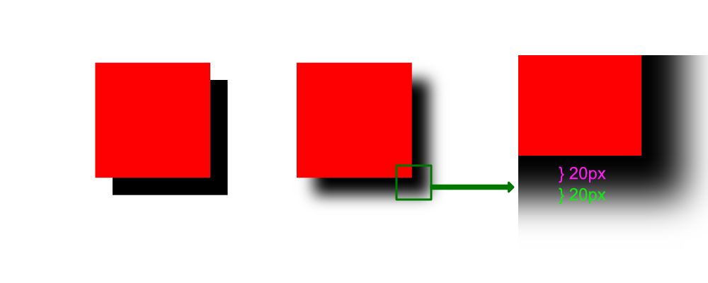
In the figure above, both the left and right box have similar box shadow. the box on the right has a 40px blur. The blur is basically divided in two parts. Start from the no blur box at the left. The blur originates from the edge and half of it (20px) goes towards the inside, and 20px towards the outside. To sum it up: if you add 10px blur radius 100px by 100px box shadow, the shadow would end up being 105 px by 105 px in size with the blur included.
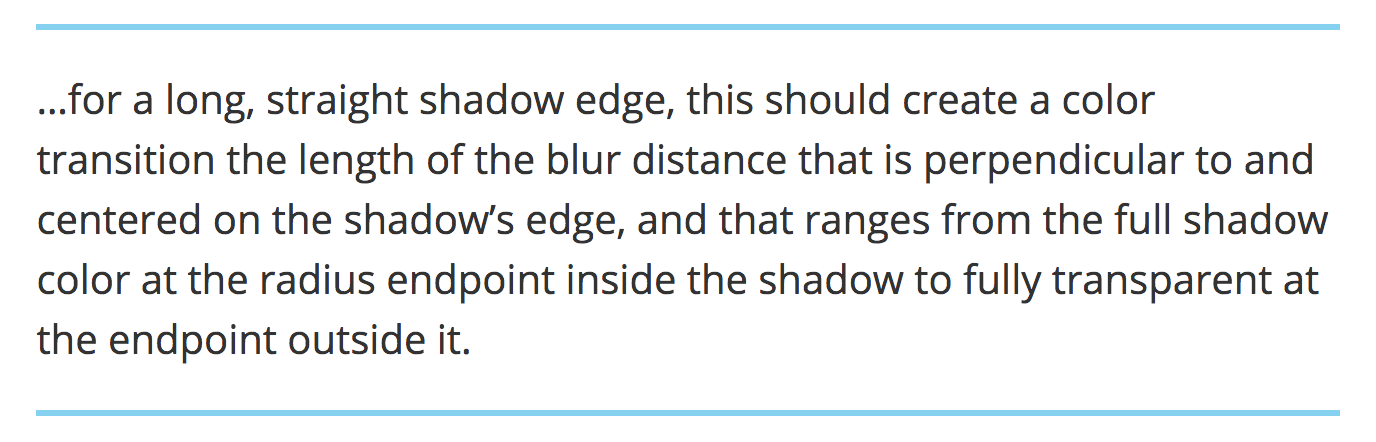
This might be very confusing at first. It gets easier. Here's a screenshot from MDN on this topic:
The Spread radius:
Spread radius is a box-shadow only feature. It's simpler. In summary: add 10px spread to a 100 by 100 px shadow and the shadow ends up being 120 by 120 px. Spread increases shadow size in all the sides.
Multiple Shadows:
One of the coolest thing about CSS shadows is the ability to use virtually as many shadow per element as you want. Just separate them with comma. so the below syntax:
box-shadow: 1px 1px red, 3px 3px 5px green;will produce two shadows. I looked into the specs to find out the maximum number of box shadow a element can have, turns out the answer isn't as straight forward. But you might wanna be cautious while using multiple shadows (will explain the reason in the next section)
Performance:
Everything in this world comes with a cost. CSS shadows aren't exception here. You might not notice any difference in generic devices, but when you are thinking about compatibility and accessibility, many low spec devices might struggle to render too many box shadows. In the last section, as we discussed about multiple shadows, although you can add as many box shadow to an element, you should definitely consider the fact that one additional shadow will add more load on the client. With that being said, in normal application, it won't matter anyway.
The discussion on box shadow can be made longer, this post is almost like scratching the surface. Many of the readers might already know what was discussed, For many there might have been something new to learn. Thanks for reading anyways.